Population Pyramid Charts
Overview
Population pyramids can be modified to display as:
- Vertical Bars
- Horizontal Bars
- Lines
- Vertical Lines
- Filled Lines (Area)
- Vertical Filled Lines (Vertical Area)
Note: See our Population Pyramid Gallery for inspiration on all the different population pyramid possibilities.
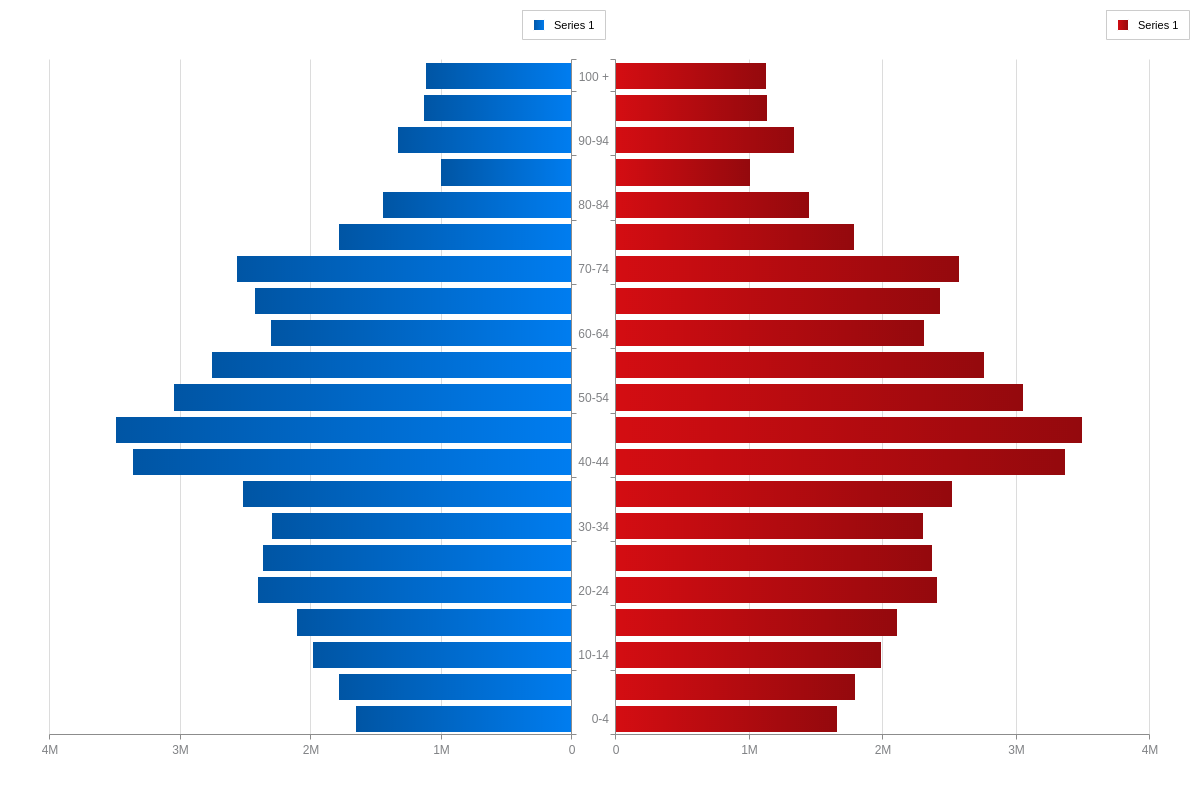
Population Pyramid Chart Type
In your chart object, add a type attribute and set the value to pop-pyramid.
{
  type: 'pop-pyramid',
}
Data
Population pyramids accept data in the form of a series object array.
Data-Side and Values Array
Create a series object array of length 2. Within each object, set the data-side attribute to either 1 (left side) or 2 (right side), with no repeated numbers. Set each side's values within the values array. Set the scale values within the scale-x object.
{
  type: 'pop-pyramid',
  scaleX: {
    values: [ '0-9', '10-19', '20-29', ...] // Array of strings or numbers
  },
  series: [ // Length 2 array of objects
    {
      dataSide: 1, // 1 || 2
      values: [val1, val2, ..., valN] // Array of numbers
    },
    {
      dataSide: 2,
      values: [val1, val2, ..., valN]
    }
  ]
}
Chart-Specific Properties
Make chart-specific customizations and styling changes via the options object.
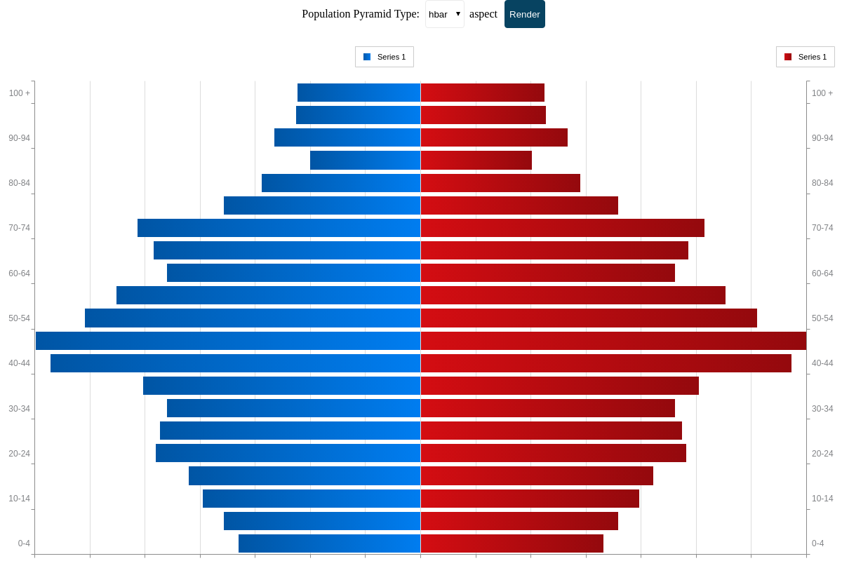
Aspects
The aspect of a population pyramid can be changed using the aspect attribute in the options object. The aspect value options for population pyramids are:
| Value | Description |
|---|---|
hbar (default) |
Data is displayed as horizontal rectangular bars. Since it is the default aspect, specifying its type is optional. |
bar |
Data is displayed as vertical rectangular bars |
line |
Data is displayed as data points plotted on an x-y axis and connected by lines |
vline |
Data is displayed as data points plotted on a flipped x-y axis and connected by lines |
area |
Data is presented as connected data points on an x-y axis, with the region between data points and x-axis filled in |
varea |
Data is presented as connected data points on a flipped x-y axis, with the region between the line and x-axis filled in |
{
  type: 'pop-pyramid',
  options: {
    aspect: 'bar' // | 'hbar' | 'line' | 'vline' | 'area' | 'varea'
  }
}
The following demo illustrates the different options available for population pyramids:
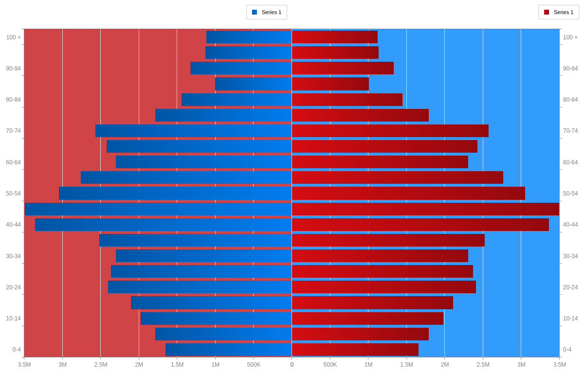
Side Styling
Within the options object, the side-1 and side-2 objects allow you to configure the various styling attributes and objects of each side of a population pyramid.
{
  options: {
    'side-1': {
      plotarea: {
        backgroundColor: '#D04347'
      }
    },
    'side-2': {
      plotarea: {
        backgroundColor: '#319CFC'
      }
    }
  }
}
Further Customization
Once you have your basic chart, you can customize and style it to fit your data visualization needs.
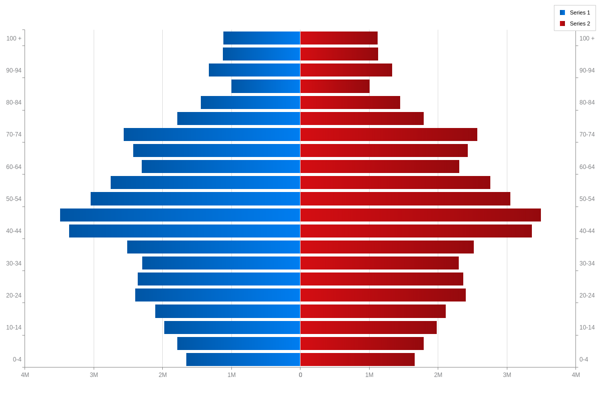
Legends/ Shared Legend
Enable and style a legend for each side of the population pyramid by creating a legend object in your chart object.
Setting shared: true in the legend object merges the legend items of the plot objects from both sides into a single, shared legend object. Omitting the shared attribute, or setting it to false, will keep the legend items from each side in their own legend objects.
Note: Learn more about legends with our [Legend Tutorial] (https://www.zingchart.com/tutorials/elements/legend) and shared legends with our Shared Interactions Tutorial.
{
  legend: {
    shared: true // false
  }
}
Label Placement
Scale labels can be placed in two places in a population pyramid. By default, labels are duplicated on both sides of a population pyramid ('label-placement': "side"). Setting 'label-placement': "middle" will place the labels between the two sides of the population pyramid.
Note: Learn more about scale labels with our Scales Tutorial.
{
  type: 'pop-pyramid',
  options: {
    labelPlacement: 'middle'
  },
}